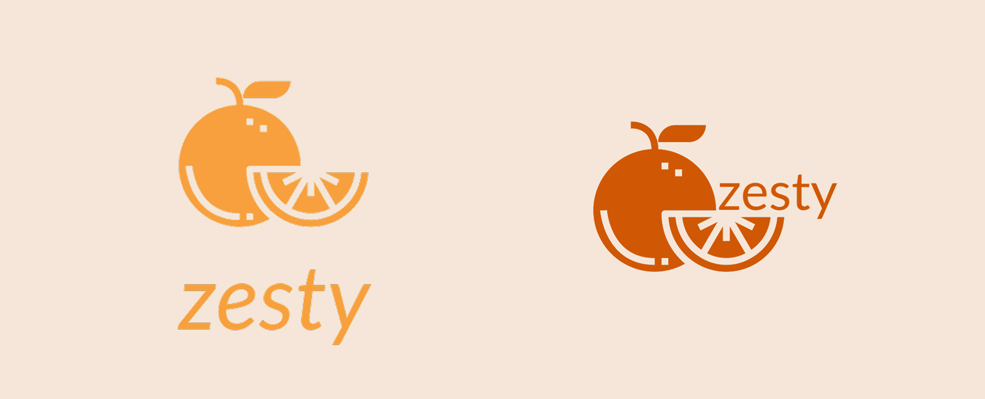
The goal was to create a bold and energetic brand
identity that captured the brand’s vibrant and fresh personality.
Focusing on using bright colors, bold patterns, and playful
visuals to ensure the brand stands out and is easily recognizable on shelves and in
campaigns. Trying to communicate an aesthetic that is fresh, fun,
and clean while creating an memorable look.

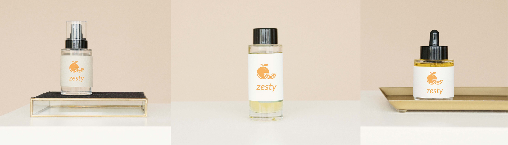
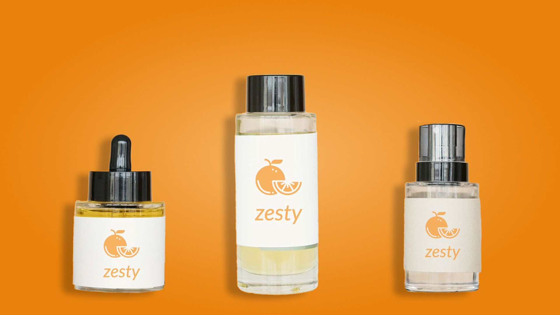
The packaging communicates the brand’s clean, organic, and uplifting identity. The bright orange reinforces the bold, fresh, and fun personality, and showcasing the natural citrus ingredients that inspire the skincare line. By keeping the bottles clear and the design uncluttered, the focus remains on the product’s natural quality while still delivering an energizing, vibrant aesthetic that feels both modern and refreshing.
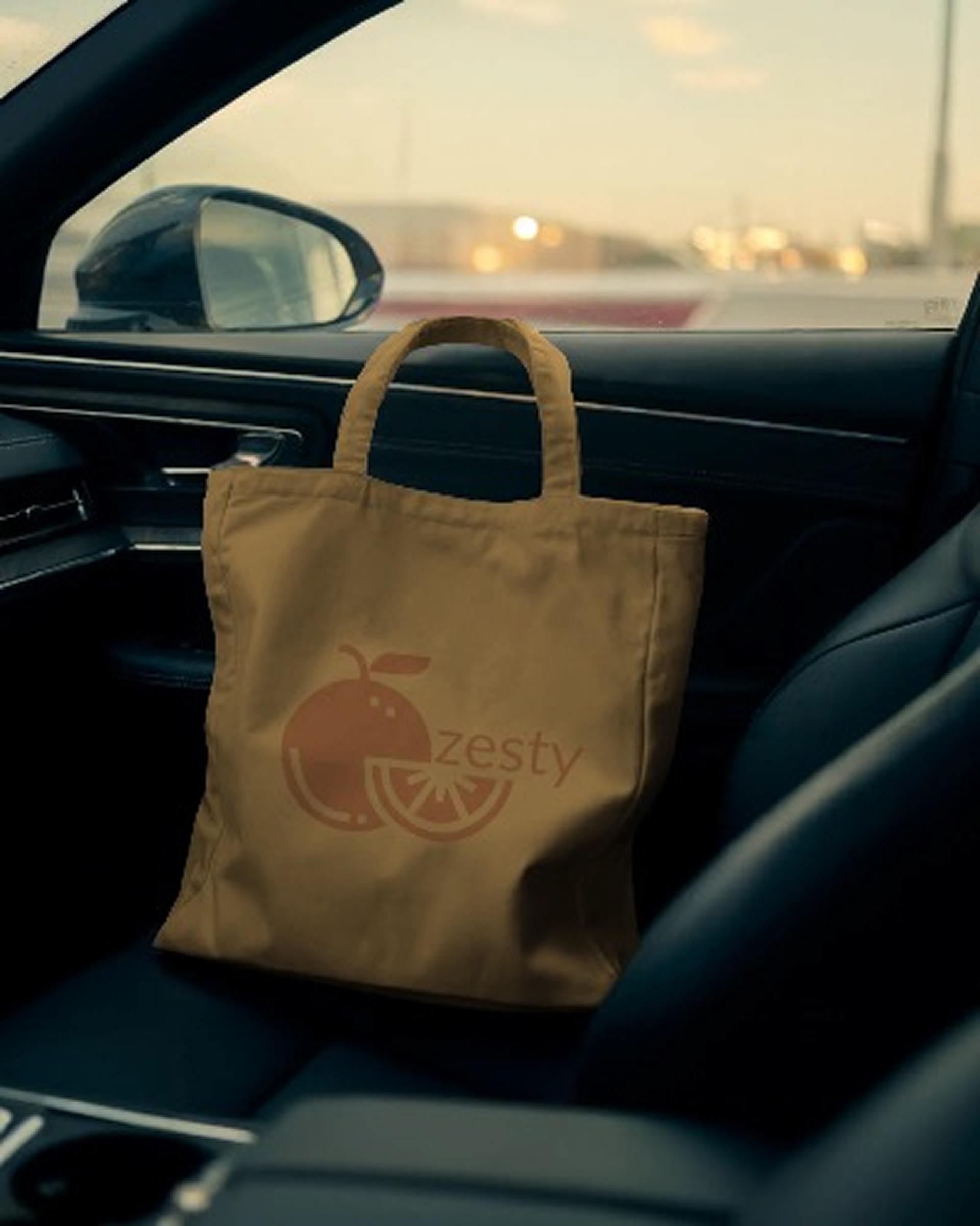
I designed each packaging element to extend the brand’s identity of freshness, vibrancy, and natural simplicity. The use of bold orange across bags, boxes, and wrapping reinforces the citrus inspired concept, creating a cohesive visual language. Keeping the aesthetic clean and approachable, aligning with the brand’s commitment to natural, organic skincare. The simple materials evokes a sense of warmth, wellness, and positivity, turning every unboxing moment into a bright, refreshing experience.