
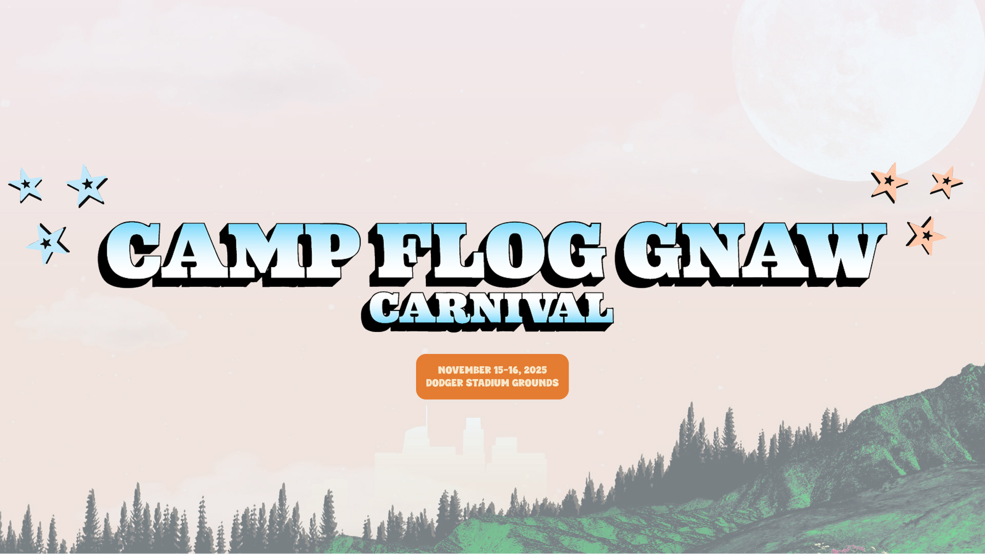
Camp Flog Gnaw website redesign is to refresh and elevate the existing site by improving both user experience and visual impact. Although the current website has solid foundation elements, it also requires revisions to improve its overall design, and usability. The redesign will better reflects the festival’s unique energy and aesthetic, making information easier to find and the overall experience more engaging for all visitors.
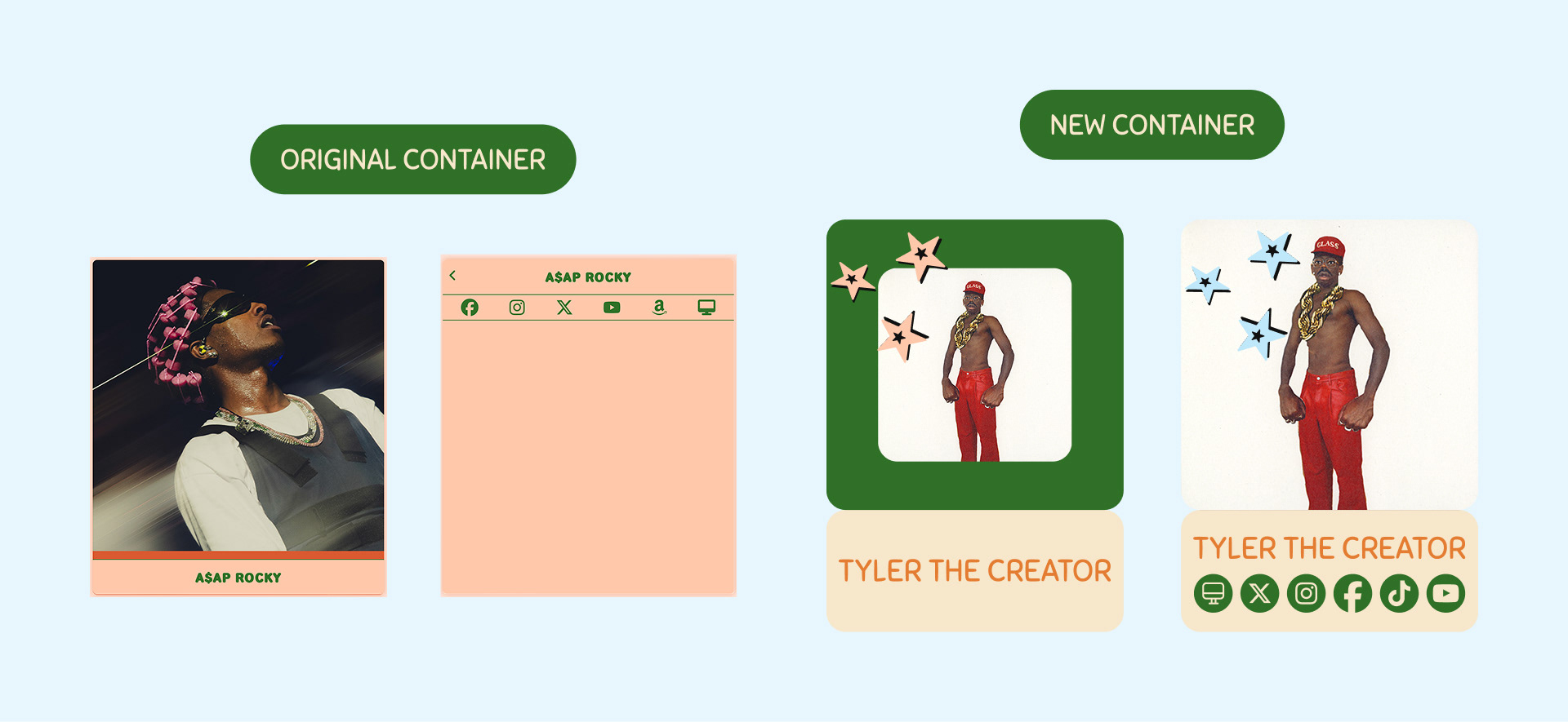
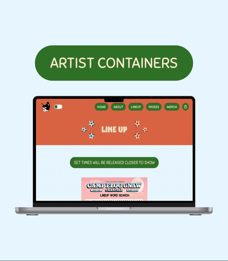
Updating the artist containers seemed necessary to improve the containers function for the viewers. The original was a flip on click showing very small type, lots of wasted space, and losing sight of the artist. The new container gives views a full view into the artist by first blowing up the image on click, but also providing their content and never losing sight of the artist.
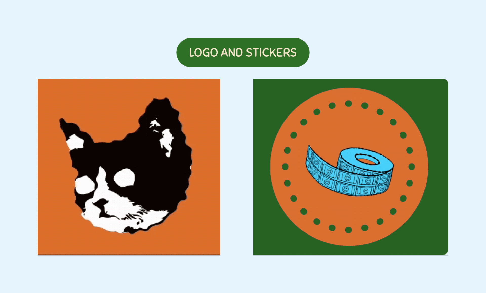
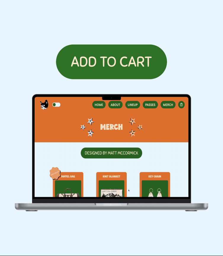
The original website had a great logo and a bunch of fun stickers throughout their website that I wanted to keep in the redesign. I did want to give them a little more flare by giving them either a color change or a slight movement. This is to give the user more fun interactive elements to play with while discovering and purchasing tickets to camp flog gnaw.
To learn more about the project check it out on Behance!